office Bau Sallinger
Year 2010
Category Industry
Location Liebenfels
Photos Kurt Kuball
Description
TRADITION MEETS INNOVATION
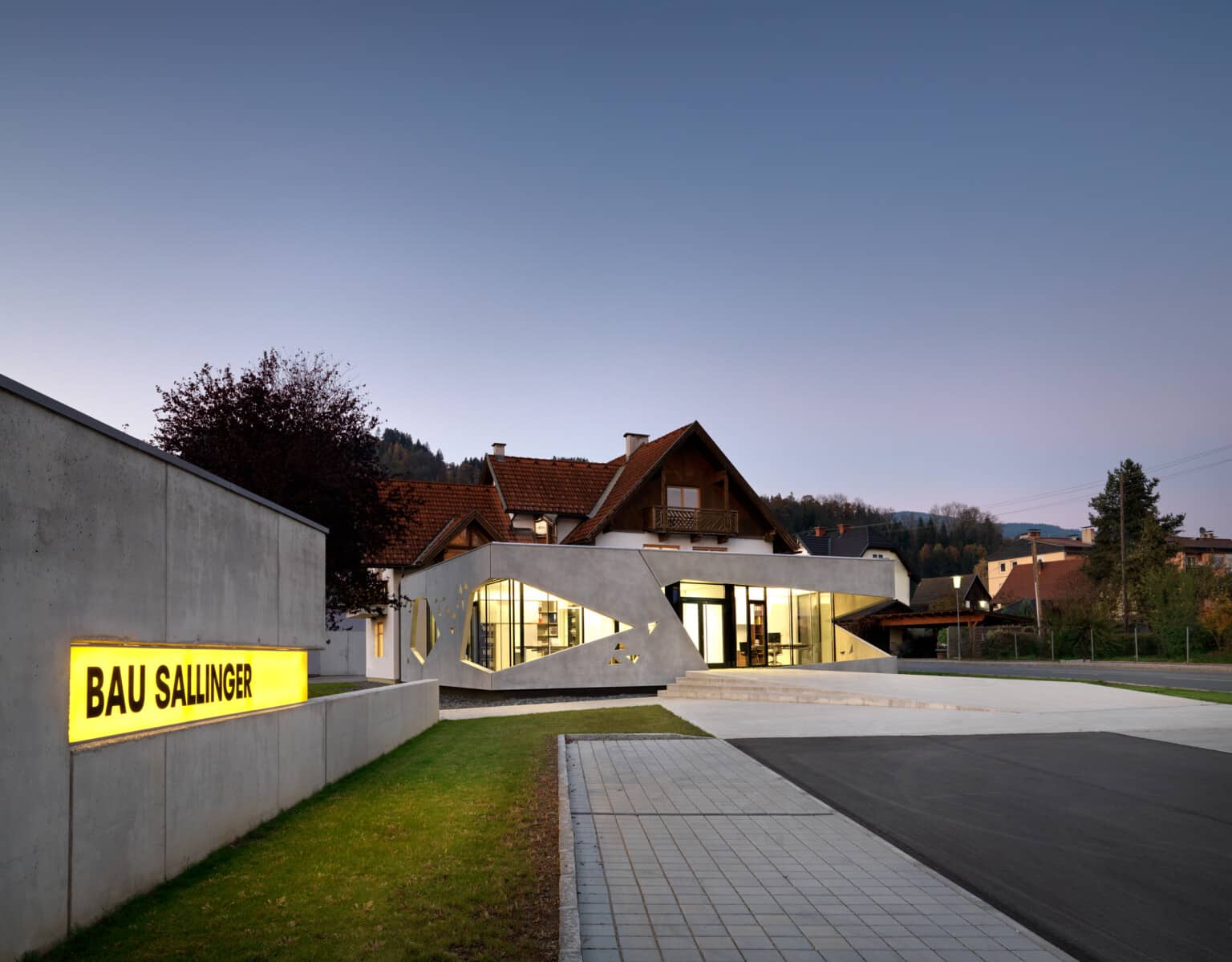
An extension of the office wing in close connection with the existing residential and office building was required.
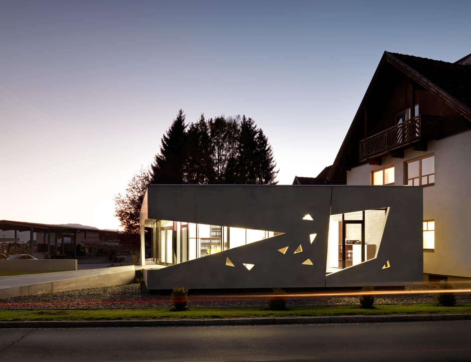
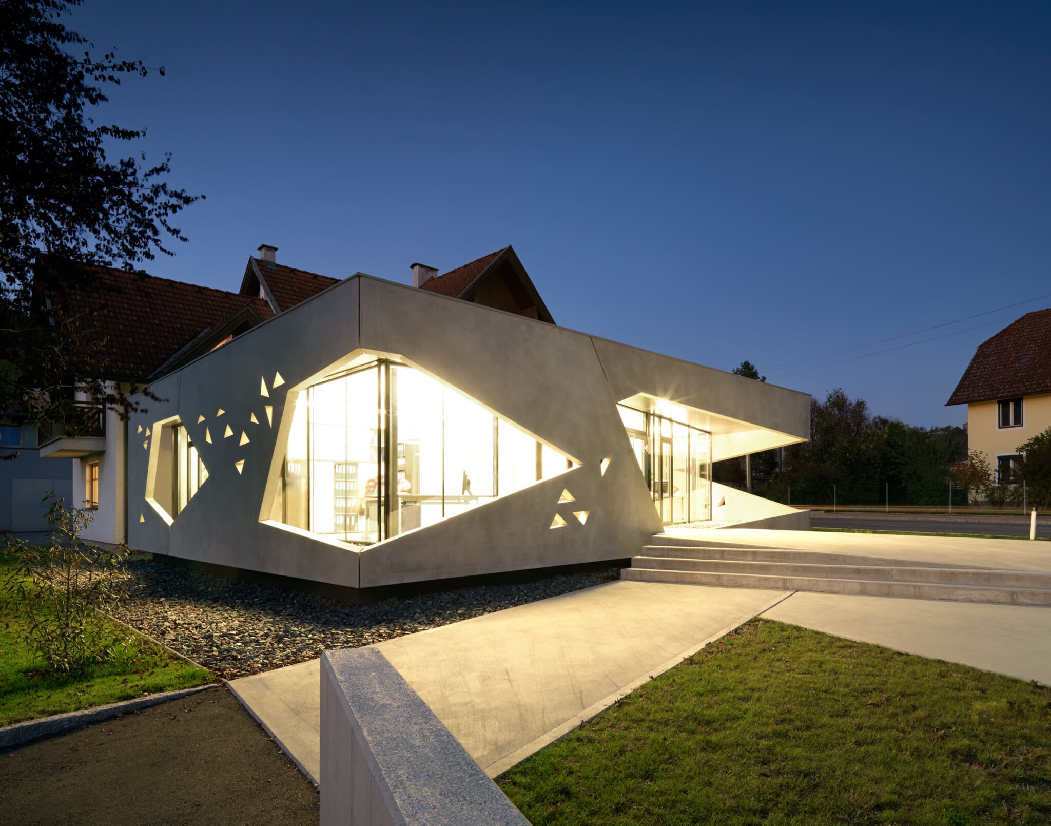
From an architectural point of view, the extension should be formulated as a clearly legible development step in the company‘s history. Old and new are intertwined and the existing building is further developed in scale. The extension is a one-storey office building that is docked to the existing building in the south. The clear, simple form takes up the ground floor height of the existing building and hovers above the surrounding level. The new structure is additionally influenced by the building alignment and thus fits into the surrounding urban context. The statics of the building are formed by a few wall panels that zone the space and leave it open to many development opportunities for the future.
Die Statik des Gebäudes wird durch einige wenige Wandscheiben gebildet, die den Raum zonieren und ihm für die Zukunft viele Entwicklungsmöglichkeiten offen halten.
Fig. 1
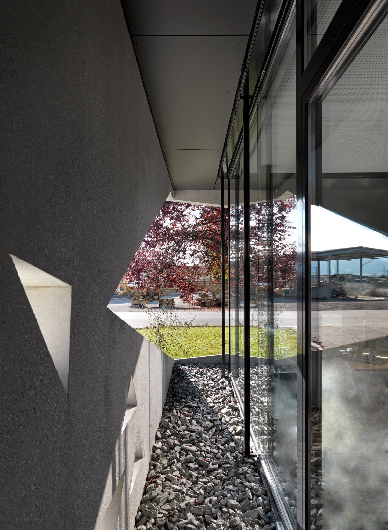
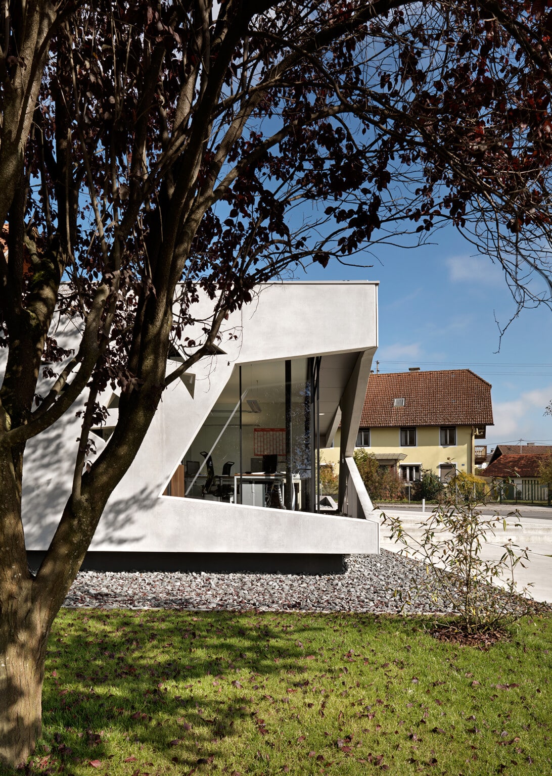
The planned glass facade is presented with a second facade made of exposed concrete. The „second skin“ of the building takes on several functions. It serves as a sun and visual protection, its materiality places the raw original material concrete in the foreground, the background becomes the foreground.
Fig. 2
The second shell creates spatial depth and thus forms the basis for a variety of light and shadow effects that give the building a poetic touch.
OPENINGS – POLYGONS – SIMPLICITY BRINGS COMPLEXITY
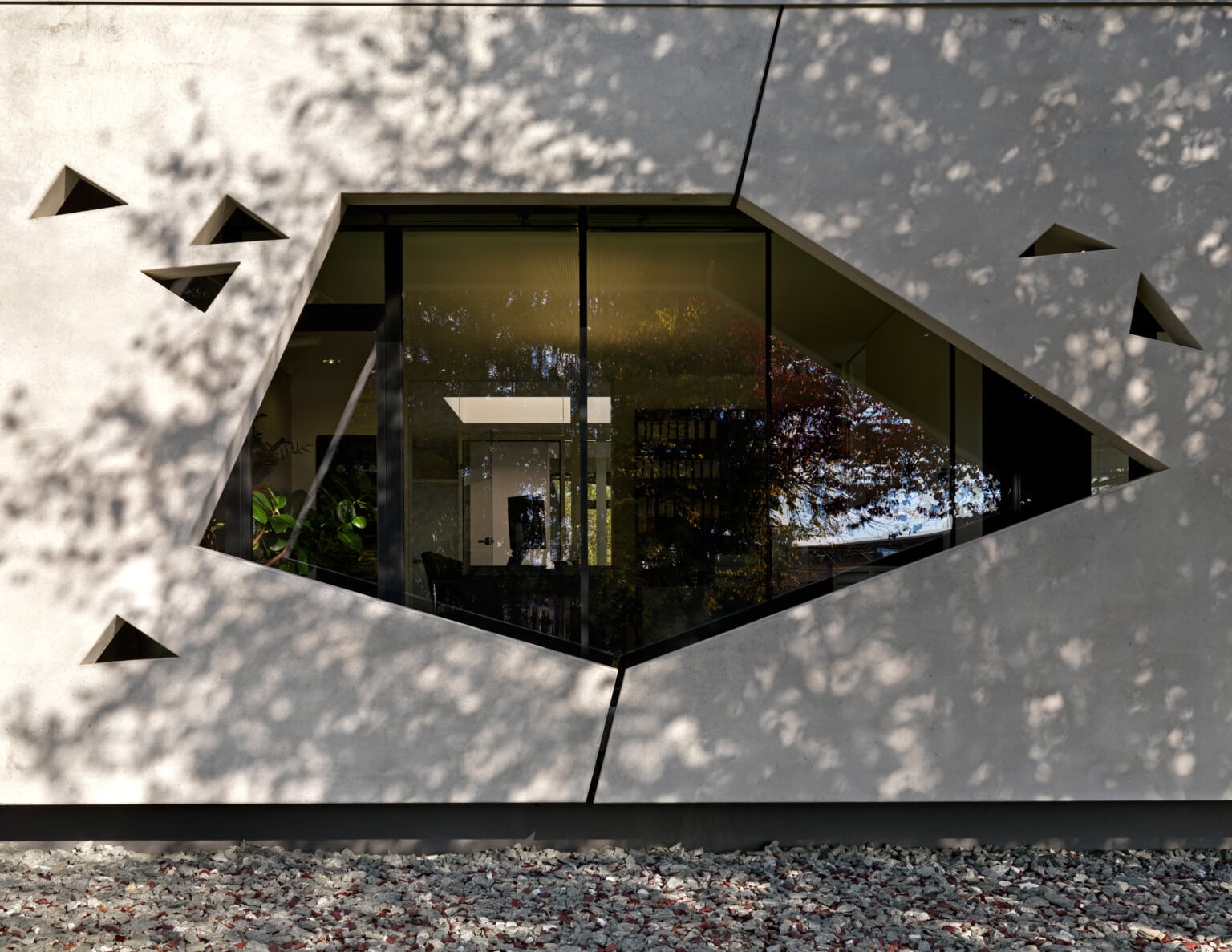
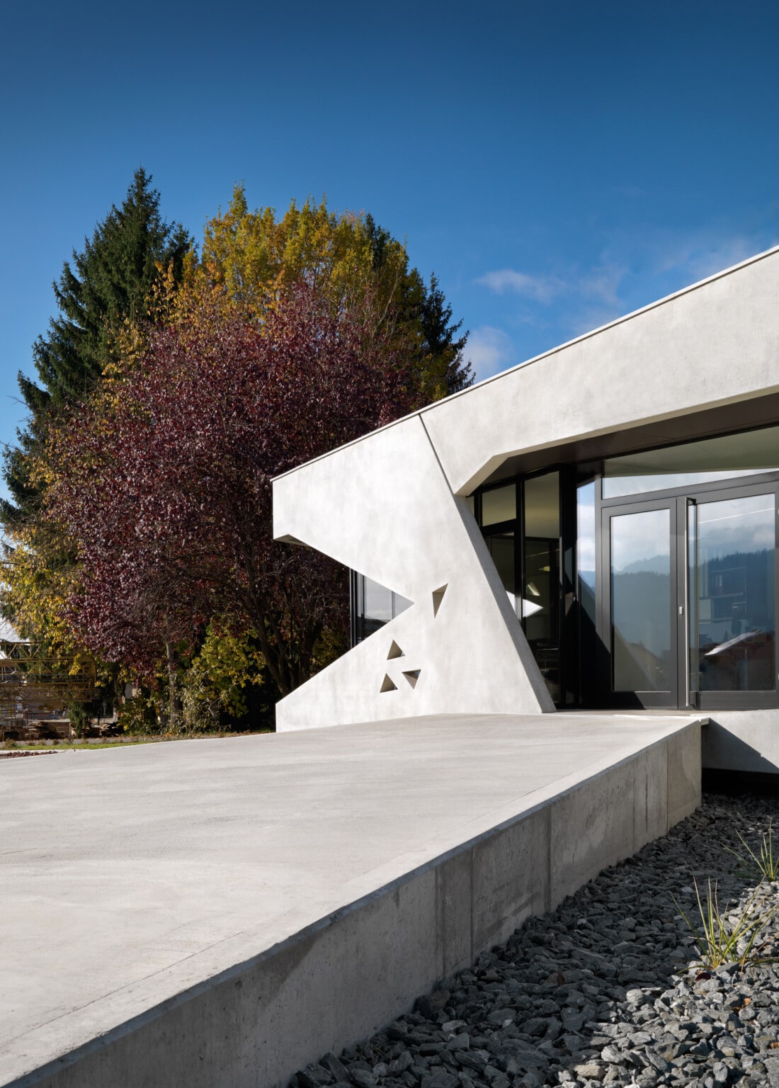
Starting from a simple geometric shape, the triangle, i.e. a polygon, the openings are formed from polygons with three or more sides.
The polygons structure and dynamize the building - communicate inside and outside, make the functions legible.
For example, the eye is the polygon in the area of the fleet office - the eye overlooks the fleet and the entire factory premises. The entrance is formed by a dynamic, elongated polygon. This polygon guides the viewer into the building as he drives past and creates a clear orientation situation. The polygon in the management area is a standing, self-contained polygon that radiates stability and calm.
THE RAMP
The ramp stages the way into the building. It creates path and space at the same time and ensures that the building is accessible to the disabled. It forms the necessary forecourt and distance space to buildings.
