construction activities Fundermax
Year 1999-2012
Category Industry
Location St. Veit an der Glan
Photos Paul Ott, Severin Wurnig, Kurt Kuball
Description
“YOUR BUILDINGS ARE AS YOU ARE.” LOUIS SULLIVAN
Architecture can be experienced visually, is omnipresent and durable. For us, corporate architecture is the intense engagement with of a company, its products, its goals, its culture and its philosophy. When used correctly, architecture makes a significant contribution to the development of a company and its culture, strengthens the brand and communicates the company‘s values internally and externally.
From 1999-2012 we worked with the company Fundermax in St. Veit and realized the following projects for them:
Fig. 2
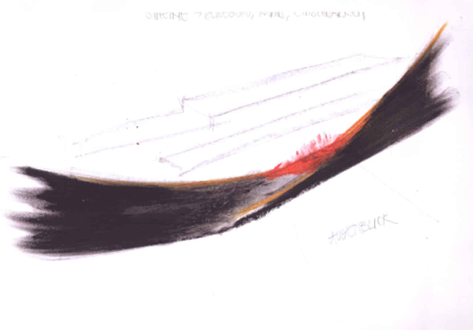
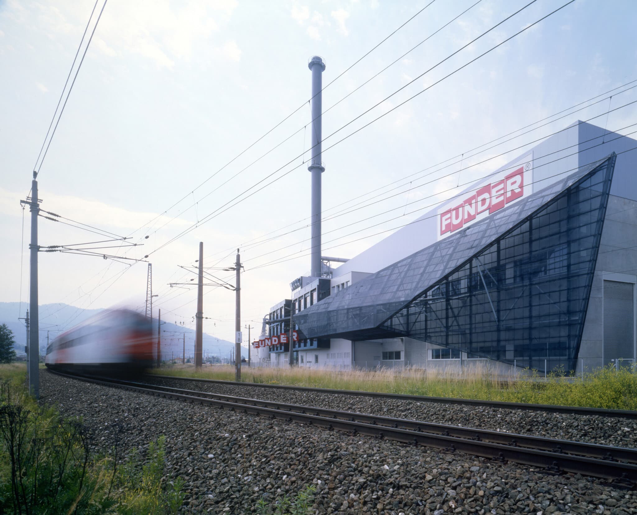
realized expanded metal facade Funderwerk 1, east view, 1999
The front façade directs the eye of the beholder (passenger on the train) to the center of the St. Veit Funderwerk. From a distance, a clear form appears, a guiding line, viewed up close the facade dissolves. Through the expanded metal surface, there is no interference with the working areas behind the facade.
Photo: Paul Ott
Fig. 5
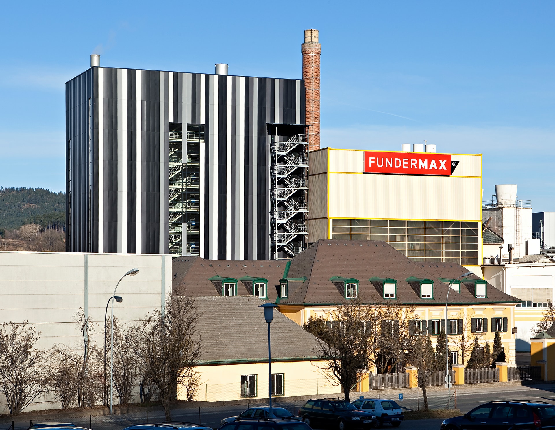
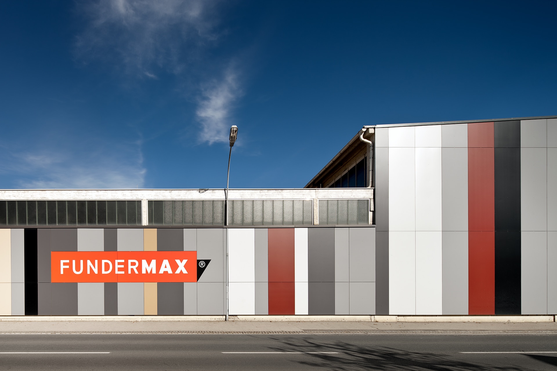
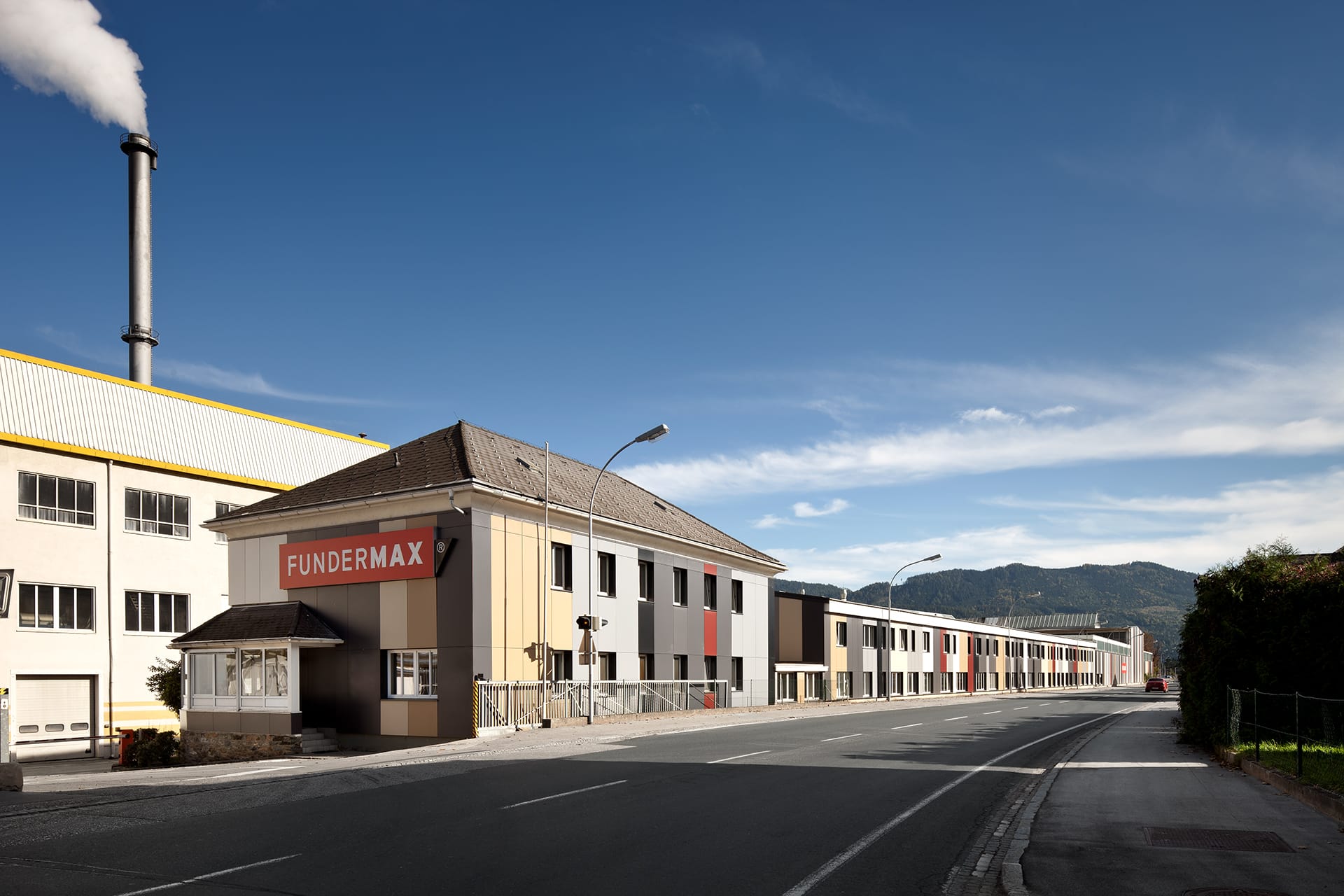
facade of Funderwerk 1, Fundermax exterior, west elevation, 2012
The existing facade of Fundermax Plant 1 along Klagenfurter Strasse is mostly perceived from the perspective of a car driver at a relatively sharp angle. Due to its location directly on Klagenfurter Strasse, the facade is exposed to a lot of dust. The buildings joined together to form a facade are relatively heterogeneous in terms of their facade appearance with regard to their facade appearance.
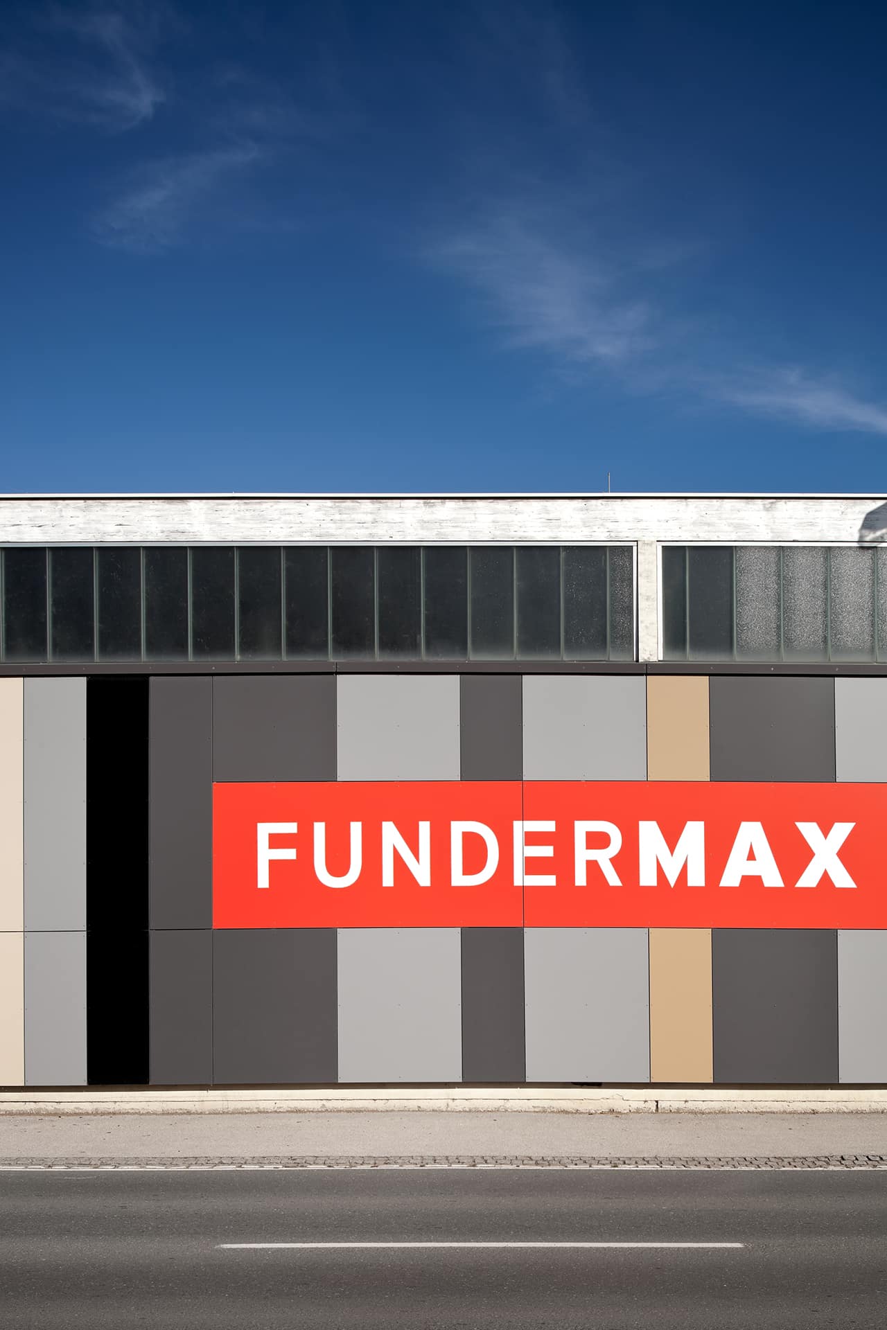
The design for the redesign of the facade responds to the themes of speed, transition to the city and the individual structures. The facade is clad with Fundermax – Exterior panels. The widths of the individual surfaces are different.
In addition to various shades of gray, warmer brown and ocher tones are used as colors. The southern, large buildings are divided into larger colored areas. As a result, the buildings appear calm, like a fan of colors when driving past. In the direction of the city, the areas of color then gradually become narrower – the speed slows down.
The building with the perforated facade was treated like a facade of many individual houses standing next to each other. As the final point of the facade, as the entrance gate to the factory premises, the „town house“ was formulated as a quiet, self-contained house.
